Is the Fed behind the curve?
This month I have moved my attention to Washington. I am concerned that the Federal Reserve Bank is far too inactive, potentially leading to much more significant inflation down the road. I should stress that our European readers shouldn’t worry too much, as the situation is fundamentally different on this side of the Atlantic, but rising U.S. inflation will obviously have at least some effect on European interest rates.
Open this issue (PDF)Preview
Inflation is unjust and deflation is inexpedient.
Readers of the Absolute Return Letter often ask me the pertinent question: What do you understand by the New Normal? I have become rather good at providing a very long winded answer to that question, but then Leicester City won the British Premier League in football for the very first time in the club’s 132-year history.
That changed everything. I can now deliver a short and very crisp answer. Before I share that answer with you, I have to provide some background, though. When the football season started, the bookmakers offered odds of 5,000-1, should Leicester win the Premier League. By comparison, you were ‘only’ offered 2,500-1, should Simon Cowell become the next Prime Minister, or should David Cameron become the next Manager of Aston Villa. You probably get my point – Leicester was not exactly everyone’s favourite to win the title.
Our non-British readers would be forgiven for not knowing who Gary Lineker is but, here in Britain, he is a legend. Gary was born in Leicester; he played for the club for many years, and he played for the national team no less than 80 times. On the all-time list of top scorers for England, he is third. On top of that, he managed to get through a glorious career without ever getting as much as a single yellow card. He is now presenting the BBC football programme Match of the Day and around Christmas, when Leicester was already in pole position but nobody thought it would last, he made the now famous promise on Twitter, should Leicester win:
“YES! If Leicester win the @premierleague I'll do the first MOTD of next season in just my undies.”
An entire nation is waiting for the Promised Land. Should he chicken out, I am pretty sure the BBC will dig up some health and safety rule, allowing him to protect his modesty.
Now to my answer: The New Normal is when plain logic no longer applies; when common sense takes the back seat. I have for a long time been defending the Federal Reserve Bank, and have not at all agreed with all those hawks who thought the Fed was sitting on its hands. Until recently, I felt very comfortable taking that view, but I am no longer so sure. Common sense suggests to me that the Fed ought to tighten a great deal more than they have already done, but does common sense apply? That is what this month’s Absolute Return Letter is about.
One important caveat
A small but important caveat before I start: The following is about the U.S. only and does not apply to any country here in Europe. That said, if the Fed were to begin a much more substantial tightening programme, it would not only affect U.S. interest rates, but almost certainly also do some damage to interest rates in other parts of the world.
I should also point out that I actually finished writing the June Absolute Return Letter about three weeks into May and, since finishing my writing, certain noises have come out of the Federal Reserve Bank that suggest to me that not all Fed officials are behind the consensus to do next to nothing. The President of the Federal Reserve Bank of Philadelphia, Patrick Harker, said last week that the Fed could raise rates two or even three times this year, and possibly as early as when the FOMC next meet in June. Two other Fed bank presidents also offered quite hawkish views earlier the same day.
This has already had a significant impact on interest rates. As you can see from chart 1, the probability of a Fed hike, as implied by interest rate futures, has spiked in recent days.

Source: The Daily Shot, Nordea Markets, Macrobond, May 2016
As you will see later, two or even three increases (assumingly of 25 bps each) will still keep interest rates well below where they ought to be at this stage of the economic cycle, so my overall conclusion remains unchanged unless we see some real action from the Fed.
When does the Fed normally begin to tighten?
In the past, the Fed has begun to tighten when approximately one third of all U.S. states have had unemployment below NAIRU, but not this time (chart 2). For those of you, who are not familiar with the term, NAIRU is the Non-Accelerating Inflation Rate of Unemployment; i.e. it is the level of unemployment above which inflation doesn’t rise, when unemployment falls. NAIRU varies over time but, at present, the FOMC is of the opinion that NAIRU is around 5%.
5% is precisely the rate of unemployment at present. Yet, there are no signs of the Fed taking any (meaningful) action. So one is beginning to wonder – is something else going on? It is not as if there is no need for the Fed to act. Allow me to share some charts with you, and please note that charts 2-7 are all based on U.S. data.

Source: Deutsche Bank, Haver Analytics, Federal Reserve Bank, BLS, CBO, April 2016
As the U.S. came out of the worst of the Global Financial Crisis (‘GFC’) around 2010, there were more than six unemployed for every new job opening. That number is now down to 1½ (chart 3).
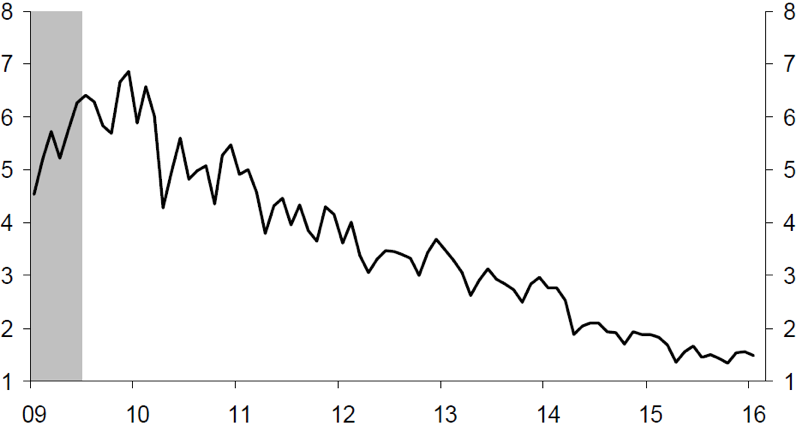
Source: Deutsche Bank, BLS, JOLTS, April 2016
Hourly earnings, which took quite a dent in the first few
years following the GFC, have finally begun to rise at a more meaningful rate
again (chart 4).

Source: Deutsche Bank, BLS, April 2016
Another measure of how well the employment market is doing – the number of new job openings – is being entirely ignored by the Fed (chart 5).

Source: Deutsche Bank, Federal Reserve Bank, BLS, April 2016
The Fed has always hiked rates 2-3 years after the trough in employment growth, but they have chosen to do next to nothing this time (chart 6).

Source: Deutsche Bank, Federal Reserve Bank, BLS, April 2016
The Fed has always been a hawk on unit labour costs – at least in my lifetime. As soon as unit labour costs have taken off, the Fed has reacted – but not this time (chart 7).

Source: Deutsche Bank, Federal Reserve Bank, BLS, April 2016
You probably get my point by now – something is not quite right, but what is it? Before I answer that question, let me share one more observation with you. Because the Fed is so inactive, there are signs of moral hazard growing in magnitude. Complacency appears to be sneaking in through the back door yet again. We humans never learn, do we?
There is probably nowhere better to measure the level of investor complacency than by looking at volatility across various asset classes, and volatility has indeed fallen more recently despite the many problems around the world (chart 8).

Source: ECR Research, Thomson Reuters Datastream, May 2016
Low interest rates have led to a massive
misallocation of capital
Back to my earlier question: Why do I think that the Fed has chosen to sit on its hands rather than do what common sense would imply, and that would be to raise the Fed Funds rate to at least 5-6%?
The answer is debt, or rather too much of it. The GFC was largely caused by excessive levels of debt, and one would therefore assume that many had learned an important lesson, but far from it. Since the GFC, global debt has increased by more than $57 trillion, dramatically outpacing global GDP growth (chart 9). From 2000 to 2014, global debt increased even more – by an astonishing $112 trillion.

Source: McKinsey, February 2015
I have said in previous Absolute Return Letters that a
reasonable amount of debt is actually constructive for economic growth, but I
have also made it painfully clear that too much of it can be devastating. Here
is why.
When debt rises fast (and fast in this context means faster than GDP growth), capital that could otherwise be used for productivity enhancing purposes, and hence grow GDP faster, is instead used to service existing debt, i.e. it is used unproductively. Debt rising faster than GDP is a vicious circle, because too much debt reduces productivity and hence slows GDP growth.
As GDP growth slows, more debt needs to be established in order to service existing debt, which will cause GDP growth to slow even further. I therefore think that, unless it suddenly becomes fashionable to default, debt will continue to rise and GDP growth will continue to slow in the years to come. Unfortunately, I also think that the eventual outcome is not a very pleasant one, but we may still be many years away from the end game.
What is happening here is in effect a gigantic misallocation of capital. How enormous it is, is best illustrated by taking a look at the velocity of money in the U.S., which is down to levels last seen in the Great Depression of the 1930s (chart 10). Velocity of money is calculated as total output (GDP) divided by total money supply. When the velocity of money drops, GDP isn’t growing at the same pace as money supply.

Source: BAWERK.NET
QE has led to a significant rise in money supply, and low
interest rates have resulted in a massive misallocation of capital, which has
caused the economy to grow at such an abysmal rate. Many inefficient corporates,
that should never have had access to capital in the first place, have taken
advantage of the combination of relatively easy access to capital (U.S. banks
have, unlike European banks, actually been open for business) and low borrowing
rates, and that has kept businesses alive that, under normal circumstances,
wouldn’t stand a chance of surviving.
How is it all likely to pan out?
I know – it is not pretty reading, and it gets worse. Assuming that no sovereign wants to bite the bullet and declare bankruptcy, debt will continue to rise, and interest rates will continue to fall, at least in real terms. There simply is no other way this can pan out. If one were to assume a continuation of the current trend (and that may even be a tad optimistic), global debt will rise from current levels of around $200 trillion to approximately $350 trillion by 2025.
The FOMC members obviously know all of this and realise that low interest rates are the only way a massive default can be avoided. It is therefore no coincidence at all that they appear to be behind the curve.
As long term readers of the Absolute Return Letter will know, I have argued for a long time that two factors will keep GDP growth at very modest levels in the years to come, and those two factors are (i) high levels of debt (as just discussed) and (ii) demographics. Nothing has changed on that account.
Having said that, I have changed my view in one important aspect. As debt levels continue to rise (short of any massive debt restructuring), governments will bend over backwards to keep interest rates at very low levels, as the only realistic alternative to low interest rates is default.
I have always assumed that ageing of society would keep inflation low anyway, so keeping interest rates at modest levels wouldn’t be overly difficult. However, new(ish) research from the Bank for International Settlements (‘BIS’) has shaken my firm belief that we shouldn’t worry too much about inflation in the years to come.
It turns out that inflation correlates very closely with the dependency ratio[1] in most countries. (Note: The dependency ratio is defined as the number of dependents (those aged 0-14 and 65+) to the working age population [those aged 15-64].) I could understand that inflation would be likely to rise, if a rising dependency ratio were primarily a function of more young people in society. After all, having children is obscenely expensive, but that is not exactly the case (chart 11). Why is ageing likely to drive inflation higher?

Source: Deutsche Bank, United Nations. Haver Analytics, April 2016
It is not that the
elderly spend more than everyone thinks they do. Older people definitely
consume less than the younger generations, which in itself is disinflationary.
However, they consume a lot more than
they produce (which is next to nothing), which is inflationary.
Think of it as a classic supply and demand function. Demand falls as consumers age, but supply falls even more. BIS’ argument is therefore a relative one, not an absolute one. The two curves simply meet at a different point, causing prices to rise.
We could therefore end up in an altogether undesirable situation, where policy rates should be hiked, but they aren’t because governments realise that there simply isn’t enough money in the piggy bank to service existing debt, should interest rates rise meaningfully. If you remain unconvinced by the argument put forward by BIS, take a look at chart 12, which tells a rather convincing story.

Source: BIS Working Paper 485, Bank for International Settlements, February 2015
This could potentially lead to a situation where the Fed remains
behind the curve for an extended period of time, which isn’t good. Historically, when central banks have sat on
their hands for too long, the end result has almost always been a bout of
unpleasantly high inflation, and that has nothing whatsoever to do with the
changing demographics. You may argue that this could never happen, as central bankers are independent of governments,
and I hope you are right. I am just not altogether convinced.
I am not at all suggesting a return to the high-inflation era of the late 1970s and early 1980s, where U.K. retail price inflation peaked around 17% and U.S. consumer price inflation topped out at about 14%; however, I am suggesting that ageing, as opposed to what I and many others have expected, could quite possibly lead to inflationary head winds, which is not all desirable in an environment where governments can hardly afford higher debt servicing costs.

Source: ECR Research, Thomson Reuters Datastream, May 2016
Moving away from the U.S. for a moment, as you can see from chart 13, debt-to-GDP in the U.S. is not overly healthy, but it is certainly not as high as it is in Japan. The 400% mark has already been passed there, and it is likely to go through 600% before the middle of this century. As a consequence, all wheels could come off in Japan well before it gets that serious in the U.S.
It goes without saying that debt-to-GDP cannot rise forever and, if BIS’ conclusion that inflation will rise with a growing number of old people is correct, then Reckoning Day may not be that many years away.
Investment Megatrends
Our investment philosophy, and everything we do at ARP, is driven by the long-term Investment Megatrends which are identified and routinely debated by our investment team.
Related Investment Megatrends
Our investment philosophy, and everything we do at ARP, is driven by the long-term Investment Megatrends which are identified and routinely debated by our investment team. Read more about related Megatrend/s for this article:
About the Author